

Discover the Allure of Inishmore Blue
A Colour Consultant's Insight
Welcome to my colourful corner of the internet! As your trusted colour consultant in all things paint and wallpaper, I’m thrilled to have you here. Whether you’re navigating the endless choices of hues and patterns from renowned brands like Farrow & Ball and Harlequin or just seeking a splash of inspiration for your next project, you’ve come to the right place.
Navigating the World of Colours
Let's face it: the world of paint and wallpaper can be overwhelming. With so many stunning options out there, how do you choose just the right shade for your space? That’s where I come in. My job is to help you cut through the clutter, guiding you toward a curated selection of colours and designs that speak to your style and needs. Think of me as your personal colour whisperer, turning chaos into a harmonious palette that feels uniquely yours.
Weekly Colour Spotlight
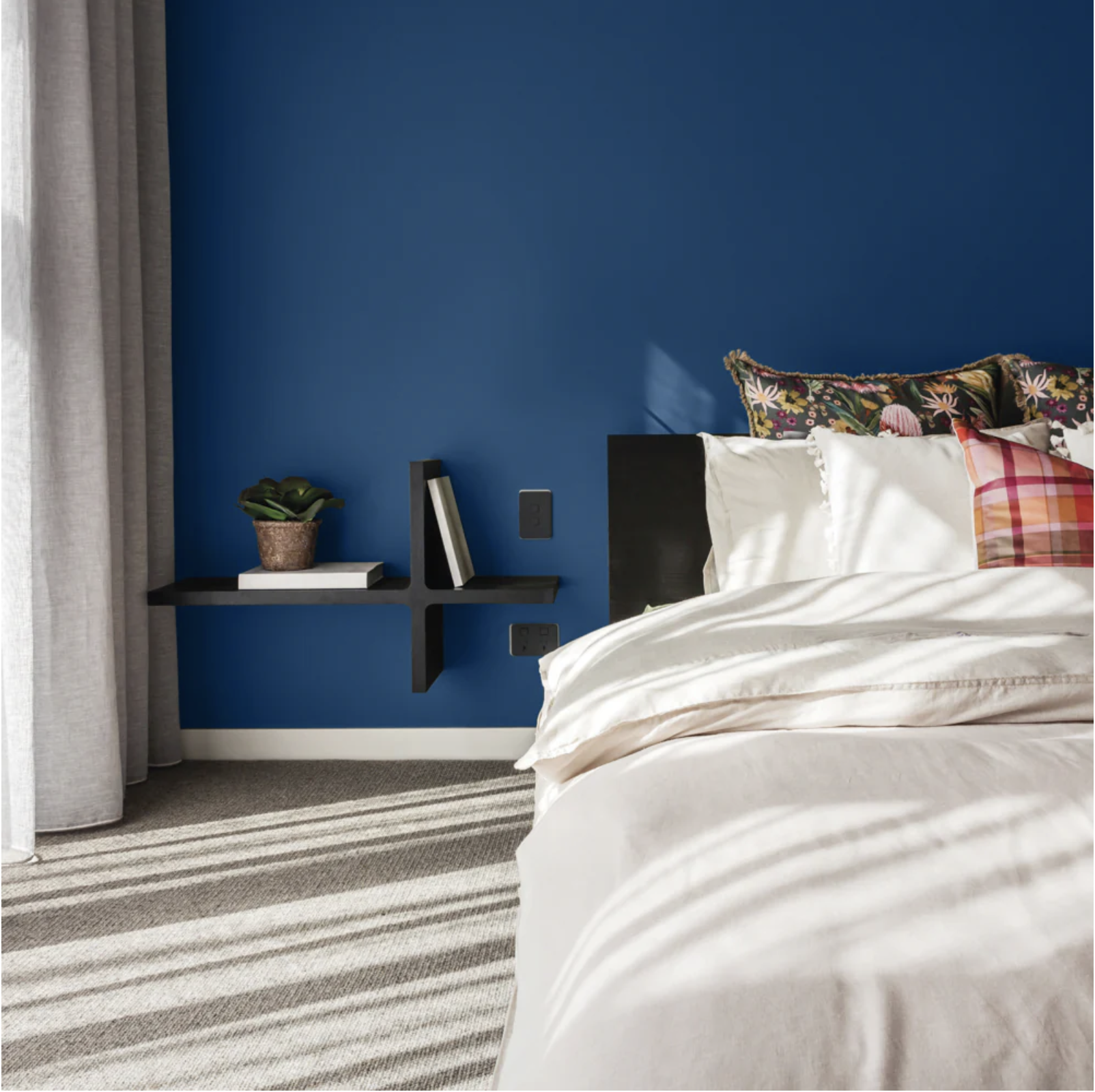
Each week, I’ll be sharing a standout colour or eye-catching wallpaper that’s piqued my interest. This week, let’s dive into a hue that's as captivating as it is versatile: Inishmore Blue by Colourtrend.
Why Inishmore Blue Deserves Your Attention
Colourtrend, an esteemed Irish paint brand, recently underwent a fabulous aesthetic makeover, simplifying their design and focusing on a more condensed colour range. This approach allows the beauty of their shades to shine through, and Inishmore Blue is no exception.
Inishmore Blue is an energetic, vibrant blue with an enchanting sea green undertone. It’s a colour that commands attention while offering a calming, stable vibe – a balance that's not easy to achieve. This hue is bold yet versatile, making it a fantastic choice for various spaces and styles.
Pairing Inishmore Blue with Other Shades
The magic of Inishmore Blue lies in its adaptability. Here are some exquisite pairings that showcase its charm:
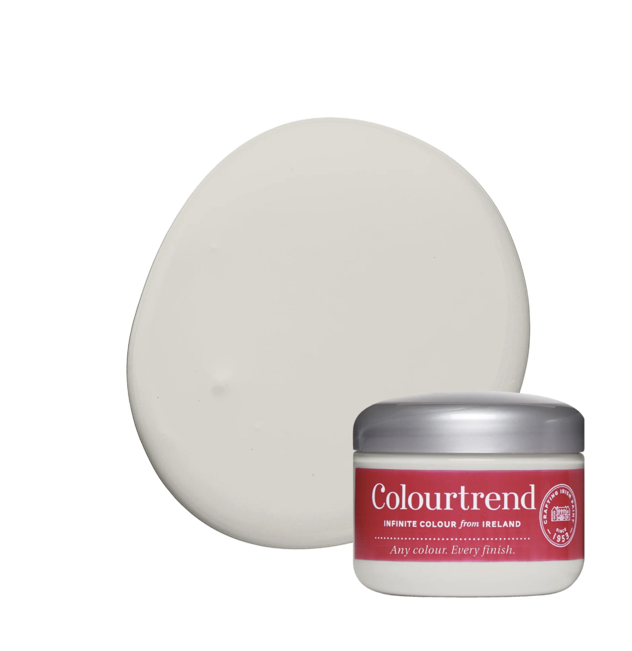
Subtle by Colourtrend: This soft, beige-grey tone is perfect for adding a delicate touch to Inishmore Blue’s strong presence. Together, they create a harmonious blend that’s both sophisticated and welcoming.
Lowland by Colourtrend: Looking to introduce a feminine touch to this masculine hue? Pair Inishmore Blue with Lowland, a stunning plaster pink with a gentle ash undertone. The result is a balanced, elegant look that brings out the best in both shades.

Share Your Thoughts!
What do you think of Inishmore Blue? How would you incorporate this stunning shade into your space? I’d love to hear your thoughts and ideas, so please share them in the comments below.